Confirm Dialog
The Clinical Office Confirm Dialog extends the Angular Material Dialog Component by offering a simpler configuration process for confirmation and alert dialog boxes.

Configuration
All configuration for your confirm dialog is performed in the component you wish display the dialog in. If you plan on using the same dialog in multiple components you can use a custom Angular data service instead of storing multiple copies of the same code.
The confirm dialog component is simply a wrapper around the standard Angular Material Dialog Component which means we also need to reference the MatDialog component in our code.
Component Imports
In your component (or custom service), add the following import statements.
import { MatDialog } from '@angular/material/dialog';
V4+ import { MPageConfirmComponent } from '@clinicaloffice/clinical-office-mpage-core';
< V3 import { MPageConfirmComponent } from '@clinicaloffice/clinical-office-mpage';
You additionally need to inject the MatDialog component in your constructor.
constructor(public dialog: MatDialog) { }
Triggering the Alert
You can trigger the alert at any point in your code. This could be on retrieval of data, when showing an error or based on the action of a button click. The implementation is completely up to you.
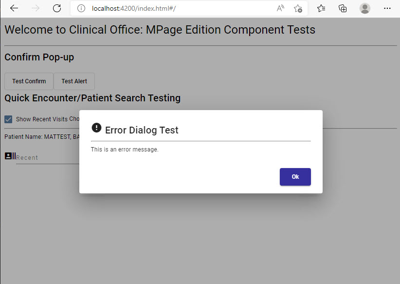
To trigger the alert, you simply need to pass the MPageConfirmComponent and your parameters to the open method on the MatDialog component.

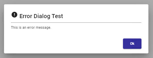
const dialogRef = this.dialog.open(MPageConfirmComponent, {
    width: '500px',
    data: {
        title: 'Error Dialog Test',
        text: 'This is an error message.',
        icon: 'error'
    }
});
Although the MatDialog will appear as a modal window, activity will still be occurring in your MPage while the dialog is on screen. It is up to you to control the flow of your MPage if needed while the dialog is displayed.
Configuration Options

Our previous example displayed a very simple error message however there are many more options available. In our example we have defined the width and data properties. The data property is discussed in detail below however there are numerous other configuration options available in the MatDialog component.
The data property is specific to the MPageConfirmComponent and offers a number of display properties. Some of these display properties have default values set that you can override.
The following table describes all the property values that can be assigned to the data property.
| Property | Description | Value | Default |
|---|---|---|---|
| title | Title text at the top of the component. | Any text string | '' |
| text | Text content to be displayed in the body of your dialog. | Any text string | '' |
| icon | Any icon from the Material Icons library. | Material Icon name (e.g. error, help) | '' |
| iconStyle | SCSS style of the icon | SCSS style name(s) (e.g. mat-warn) | '' |
| showConfirmButton | Indicates if confirm button should be displayed. | boolean | true |
| confirmButtonLabel | Text content to be displayed on confirm button | Any text string | 'Ok' |
| confirmButtonStyle | SCSS style of confirm button. | SCSS style name(s) | 'mat-raised-button mat-primary' |
| showCancelButton |
Indicates if cancel button should be displayed. *defaults to true if cancelButtonLabel assigned. |
boolean | false |
| cancelButtonLabel | Text content to be displayed on cancel button | Any text string | 'Cancel' |
| cancelButtonStyle | SCSS style of cancel button. | SCSS style name(s) | 'mat-raised-button mat-accent' |
Detecting Button Clicks
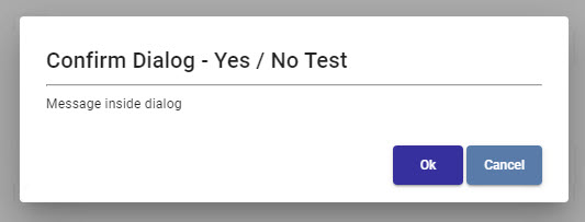
Often you will want to take some type of action once the confirm or cancel button has been clicked on your dialog. This can be easily accomplished by subscribing to the afterClosed() event of your dialog component.
The afterClosed() subscription should be placed immediately after the dialog.open assignment statement.
dialogRef.afterClosed().subscribe(confirm => {
    if (confirm) {
        // Perform an action when confirm button was clicked.
    } else {
        // Perform an action when the cancel button was clicked.
    }
});
